Building florekdesign
This portfolio presents my work and explains the decisions behind the site. I kept the interface minimal so the work stays in focus, and an AI agent implemented it under my direction.
- UI Design · AI-assisted implementation
- 2026 - Present
- Creative direction, Accessibility, Theme design
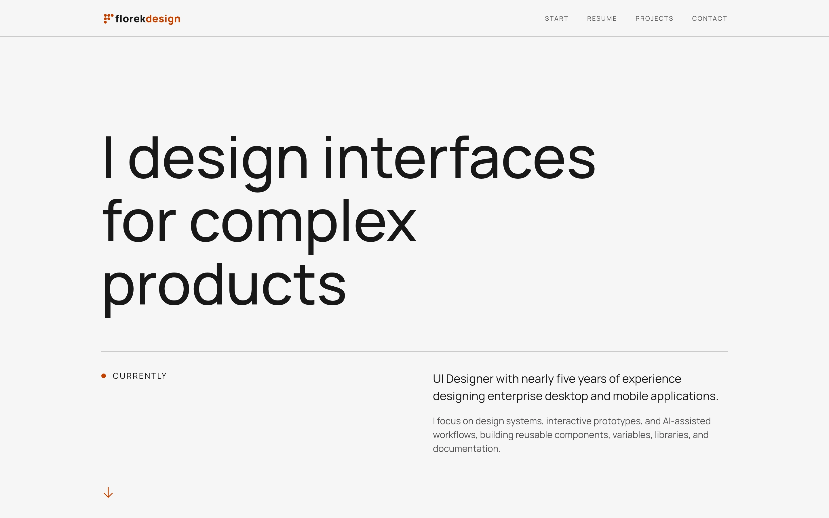
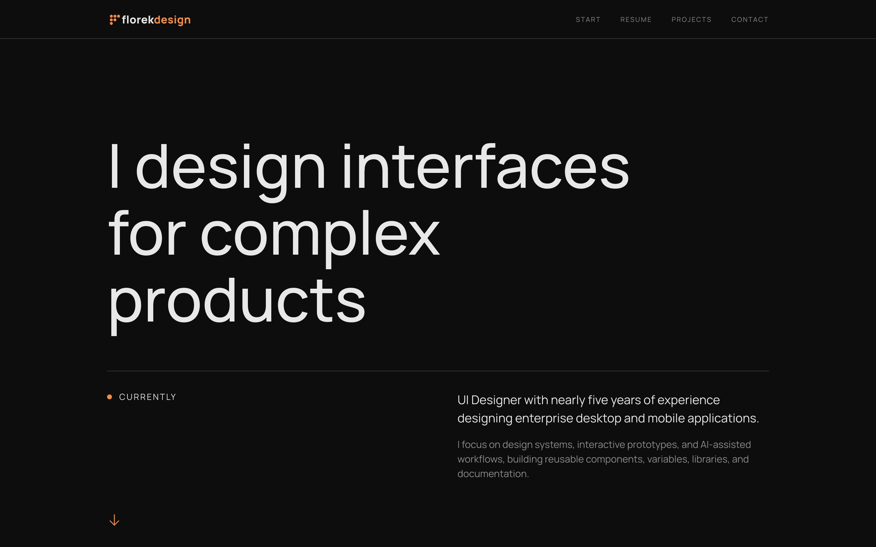
The final Home Hero, shown in the active colour theme.
Visual direction
I kept the visual language minimal: a neutral palette, one orange accent, thin dividers, and a small point motif. The Home page can be more expressive, while case study pages need to make longer text easy to read.
Colour and contrast
Most of the interface uses neutral colours. I reserved orange for actions, focus, and a few details that need more attention.
I designed Light and Dark separately instead of reversing the same colours. Text, dividers, and interaction states use different values in each theme to maintain contrast and hierarchy.
Type and spacing
I use one typeface across the site: Manrope, a geometric sans serif. Its simple shapes fit the minimal direction and work with the large amount of white space.
Using one family means that hierarchy comes from scale, weight, and spacing rather than from switching between typefaces.
Case study pages use a narrower reading column to make longer text easier to read.
Type and spacing values come from shared tokens. When I change a repeated value, the same rule applies across the site instead of creating another one-off value.
The point motif
For me, the point is a symbol of small steps and of how individual decisions build a larger whole. A single element can seem minor, but changing it can affect the whole project. The typeface is a clear example: a different typeface makes the project feel different.
The point is also part of the visual identity. Several points form the brand mark, which is based on the first letter of my pseudonym and surname.
The custom cursor is another small accent built from the same shape. It has to invert the colour behind it to stay visible on light and dark backgrounds.
How I worked with AI
Before building the site, I decided how I wanted it to present me and my work. I wanted it to feel like mine without letting the interface compete with the content.
I began with a general layout, then refined it step by step. I chose the direction, told the AI agent what to implement, and checked each result before deciding what to keep or change.
I am not a developer, so I did not review the code line by line. When I did not understand a technical choice, I asked how it worked, what else it could affect, and whether it reused existing components and tokens. The agent analysed the code and ran the technical tests, then explained the results so I could decide what became part of the site.
What I learned
I am responsible for the result
I am responsible for what I publish, even when an AI agent implements it. If something looks or behaves incorrectly, I need to understand why and decide how to fix it.
For example, the agent created too many spacing tokens, with different values for similar spaces. This made the spacing inconsistent across the site. I asked the agent to replace them with one shared scale. The change affected both the interface and the code.
I also tested the site with VoiceOver to check whether a screen reader could understand its structure and interactive elements.
AI needs direction and review
The agent worked better when I gave it a clear goal, rules, and a plan. I also needed enough context to judge its suggestions, so I asked questions or did my own research when I did not understand a technical topic.
I had to apply the same judgement to the visual side of the project. As the site developed, I noticed details that I associate with AI-generated websites. These included a small eyebrow label above the project title and decorative numbering for projects, Experience entries, and case study sections.
I liked the numbers at first and chose to keep them. Once the same treatment appeared across the site, though, it felt less like a choice for this project and more like a familiar pattern I had followed without questioning. I removed the eyebrow and decorative numbers, but kept dates and functional labels because they help people understand the content.
Numbering is not a problem by itself. The problem was that I had accepted it without asking whether the site needed it. AI can produce and repeat familiar patterns quickly, but I still decide what belongs in the design.
Different projects need different processes
This portfolio is small, so building it directly with an AI agent made sense. I would use a different process for an enterprise product.
In that setting, Figma is shared documentation for designers and developers. It needs to capture UX rules, user flows, and information structure. AI can support the work, but the team still needs shared context and review.
What comes next
I will add more case studies as my work changes. New projects may require me to extend or revise the current system.
I also want to see whether the point motif has a useful role beyond the brand mark and cursor.