Virtual University
For my bachelor's thesis, I redesigned the mobile Virtual University experience to make important information and common student tasks easier to find. The project resulted in final mockups and an interactive Figma prototype.
- UX/UI Designer
- 2023 - 2024
- User research, Information architecture, Mobile design
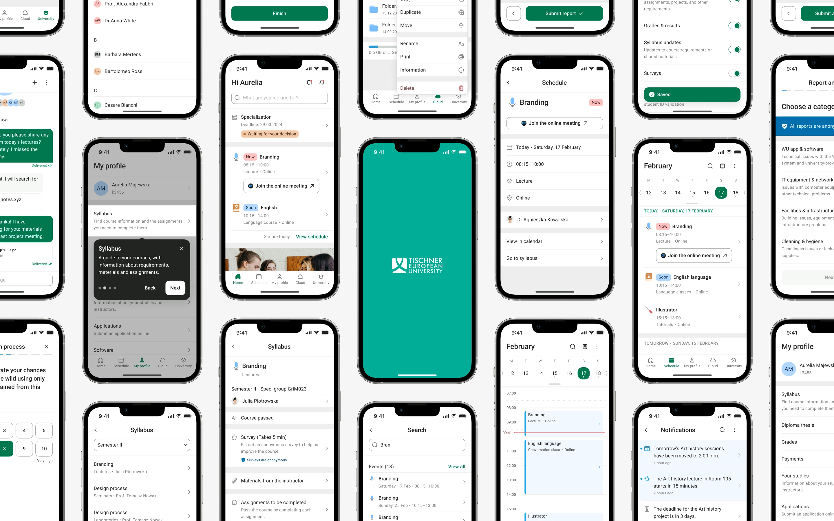
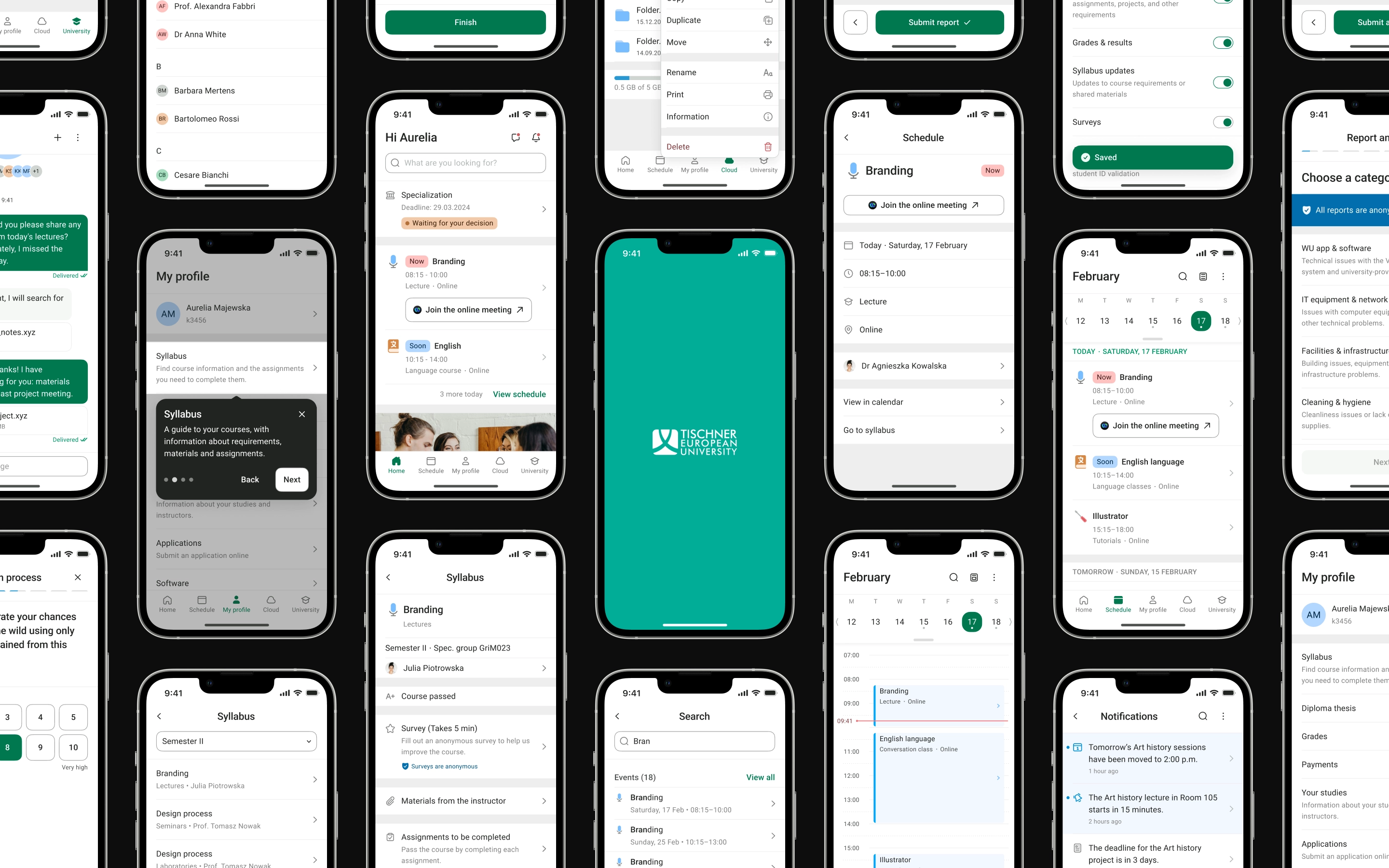
A selection of screens from the VU mobile app.
I created this redesign of Virtual University as my bachelor’s thesis project at Tischner European University (WSE). The university became part of SWPS University in 2025. I worked on the project from 2023 to 2024.
I completed the entire project under academic supervision, with most of my supervisors’ support focused on the research process. I was responsible for interpreting the findings and designing the application.
Understanding the problem
A problem I knew as a student
I had already used the existing Virtual University app as a student. Basic information was often hard to find, and the navigation was confusing. Students sometimes had to ask each other for help. Announcements were sent by email, but the same information was not available in the app itself.
The interface also looked dated. Accessibility was another concern from the start.
My own experience gave me a place to start, but it was not enough to define the redesign. I needed to understand the problems other students faced and how teaching and administration affected their experience.
I wanted to improve the app’s functionality, usability and accessibility. Before starting the research, I decided to focus on mobile because I could not design the whole product within the time available for a bachelor’s thesis project. The findings later confirmed that phones were already the main way students accessed the system.
Using research to set priorities
The research took place over several months. I reviewed other university platforms and familiar scheduling tools. With students, I combined interviews, open card sorting and usability tasks in the existing app. I also interviewed university staff.
The interviews, card sorting and usability tasks helped me understand how students used the system and where its structure and terminology caused problems. I then used those findings to prepare and run the survey.
Students who took part in the research often used the app on their phones, especially to check their timetable, grades and payments. However, the timetable itself was hard to scan.
Forms, document templates and lecturers’ contact details were also hard to find. Card sorting showed that the existing structure and labels did not match how students looked for information. Email did not always reach students quickly enough, so they also used other channels. Participants wanted notifications and important updates inside Virtual University as well.
The concept needed to make important information and common tasks easier to find. University communication also needed a clear place in the app, next to the tasks students were already completing there.
Designing the concept
Turning research into structure
The new Home screen brings together upcoming classes, university news and actions that may need attention. The timetable has its own section with a calendar and an agenda. Students can open class details or join an online class from the schedule.
I reviewed unclear and outdated parts of the existing structure with the dean’s office and IT. I then simplified the information architecture. The new structure uses up to three levels, but only where the extra depth is needed. The mobile bottom navigation forms the first level.
I also added global search for classes, course requirements, files, university documents and common actions. This gives students another way to find information across the app.
The concept also brings together notifications, messages, cloud storage, student requests and course information. I included these areas because the research showed that communication was spread across different places, while forms and study requirements were hard to find.
From structure to interface
I started with sketches, then created low-fidelity wireframes before designing the final interface. The early layouts focused on structure.
For the final mockups, I created a visual style guide and a component library covering typography, colour, spacing and a four-column mobile grid. I organised the library using Atomic Design so recurring patterns stayed consistent across the mockups. The image below shows a simplified sample from the full library.
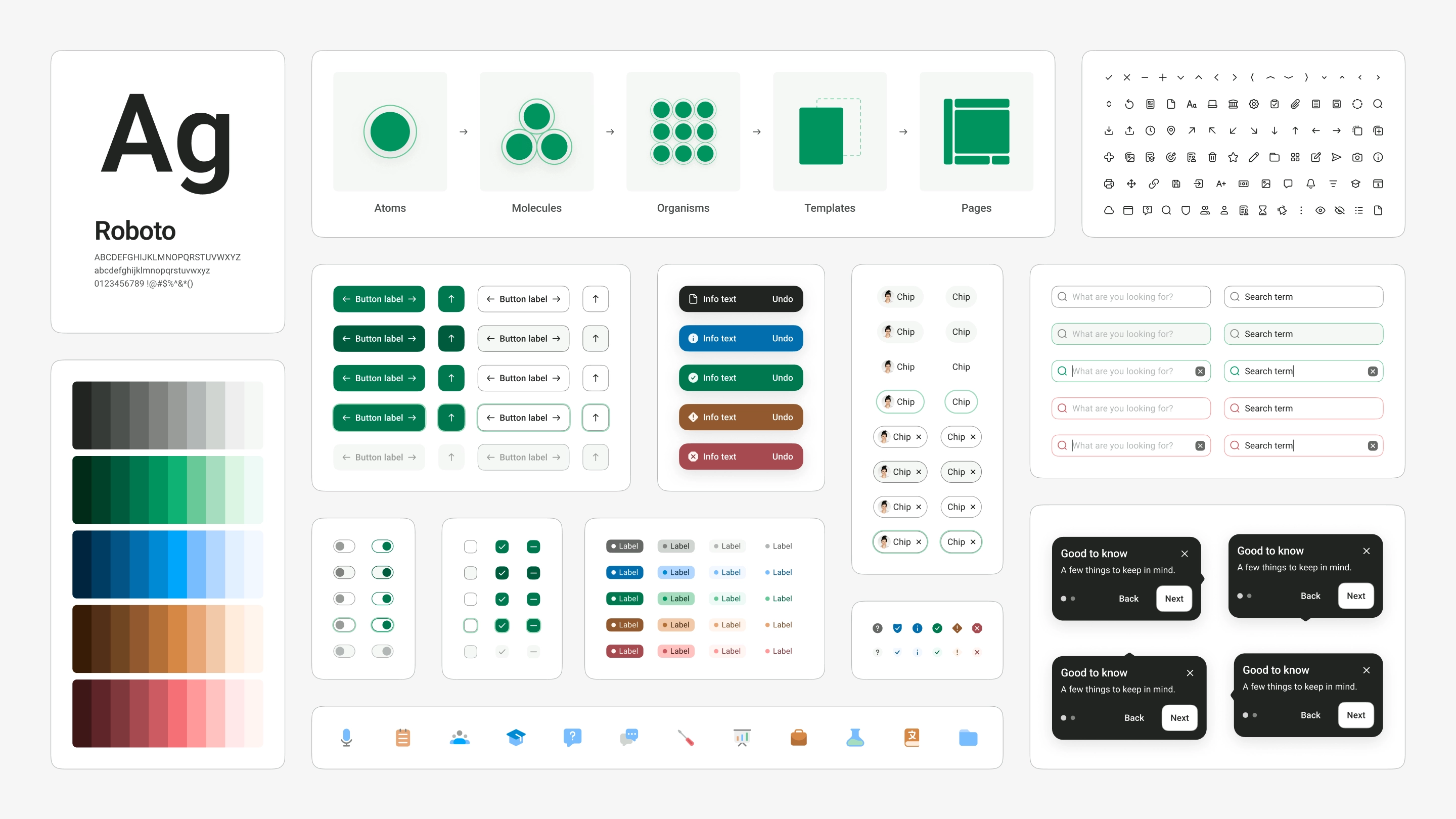
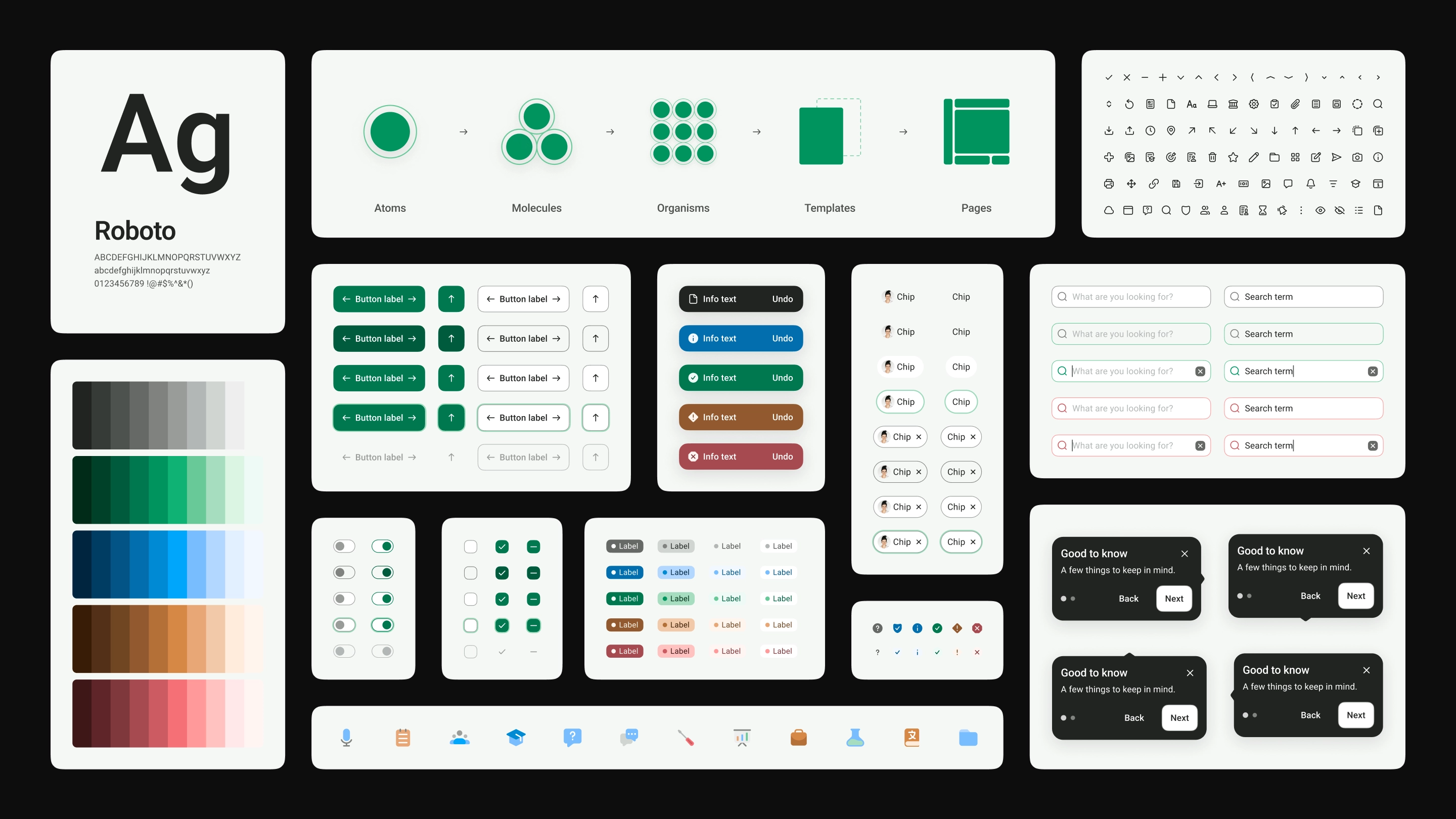
A simplified sample from the VU visual style guide and component library.
I considered accessibility when designing the interface. I checked contrast against the relevant WCAG 2.1 criteria and defined a type scale. I also worked to make labels and other interface text easy to read and understand.
Testing and next steps
What changed after prototype testing
I tested the interactive prototype with students. I wanted to see whether they understood the app, could navigate it and could find the information I asked them to find.
The main repeated issue was the term “syllabus” (Polish: “sylabus”). Some participants did not understand it, which made course requirements hard to find. Because of this, I added contextual hints for unfamiliar sections. They appear during first use and can be opened again from Settings.
What comes next
I finished the project with a mobile design system, final mockups and an interactive Figma prototype. I am happy with the direction and believe the concept has potential, but I do not see it as finished.
If I continued the project, I would do more research and run more usability tests. I might also improve parts of the visual design. A desktop version and dark mode would still need to be designed.